The MERS outbreak in the Republic of Korea began when a 68-year-old man returned from visiting countries on the Arabian Peninsula in early May. He was symptomatic after returning to Korea and visited several hospitals. He infected a few health care workers before being diagnosed with MERS and hospitalized. Since then at least 50 people have been infected. Some of these cases represent third generation infection; hundreds of people are currently being monitored. This outbreak is far from over.
Below is a preliminary timeline of the first 35 cases reported by the Korea Ministry of Health.
The data and information used here have been
derived from numerous publicly available sources including WHO, various
ministries of health, internet bloggers, internet forums, and other media
reports available online. For some individual cases,
specific details are lacking or conflicting information is presented in online
reports. However, the information and graphics presented here are based on data
which is believed to be reasonably accurate and current through June 3, 2015.
Showing posts with label graph. Show all posts
Saturday, June 6, 2015
Monday, December 1, 2014
How will we know when the number of Ebola infections starts to decline?
According to the World Health Organization (WHO), three West
African countries continue to experience intense transmission of Ebola. More
than 16,000 cases of Ebola have been reported from Guinea, Liberia, and Sierra
Leone in the past several months since the outbreak started earlier this year (link).
There is some evidence that the rate of new Ebola infections in these countries
is not growing as fast as previously estimated which is good news. The WHO situation
report published on November 26, 2014 (link)
states “Case incidence is stable in Guinea, stable or declining in Liberia, but
may still be increasing in Sierra Leone”.
However, there is great uncertainty over the quality of the
reporting data emanating from West Africa on this Ebola outbreak. Also, based
on the fluctuating numbers of newly reported cases in each of these three
countries, it is difficult to assess the increases or decreases in the
incidence of cases in these three countries. Assuming that the case numbers
reported in the WHO situation reports are representative the number of
infections in each of these countries, the average number of new cases per day
can be graphed on a timeline. Below, the average number of new cases per day is
compared with the cumulative moving average of cases since the start of the
outbreak within each of the three countries.
These graphs clearly show that the trajectory of the number
of new cases in each country generally support the WHO statement. At this time,
the number of new daily cases in Guinea appears to be declining towards the
cumulative moving average. Recent new case counts for Liberia have fallen below
the long term cumulative moving average. For Sierra Leone, the reported average
number of Ebola cases is above the cumulative moving average, This is a clear indication that rate of Ebola
infections in Sierra Leone have not yet started to decline.
Eventually, declines in the number of new Ebola infections in
these three countries will only be apparent when the daily average of newly
reported Ebola cases drops below-and
stays below-the cumulative moving average. At that time the cumulative moving
average will begin to decline as well. Comparing the number of daily new cases in
these countries in relation to the cumulative moving daily average will help identify
when there is a downturn in the number of new Ebola infections in these
countries.
Graph Notes:
1. Data used to construct these graphs is derived from the
country totals provided by WHO in the Ebola situation and data updates current
through November 28, 2014 (link).
The new daily cases counts includes all Ebola cases reported from the country
including, confirmed, probable, and suspected cases.
2. The average number of new Ebola cases per days is
computed as the total number of newly reported cases since the last report
divided by the number of reporting days. The average number of new cases per
day is recalculated after each WHO report.
Thursday, September 4, 2014
Ebola infections in West Africa continue to grow
In a previous post (Ebola is not yet under control in any West African country), I criticized an article that suggested that Ebola infections were declining in several countries in West Africa because the effective reproductive rate was less than 1.
The graph below depicts the number of new weekly infections in the three West African countries (Guinea, Liberia, and Sierra Leone). Cumulatively, the number of Ebola infections is continuing to grow. The World Health Organization has indicated today (link) that these countries have widespread intense transmission of Ebola.
Graph notes: The data used in this graph are derived from World Health Organization and are current through August 31, 2014. Graph notes: Only cases from the Ebola outbreak in Guinea,
Liberia, and Sierra Leone are used in this graph. The cases from Nigeria are
not included in the week totals, but would not appreciably affect the projected
rate of growth of new cases. All data are from WHO.
Monday, May 19, 2014
The First 2014 MERS Wave Peaked in Late April
About three week ago, I posted a graph that suggested the
first wave of Middle East Respiratory Syndrome (MERS) infections in 2014 peaked
about April 20th and was starting to decline (Number ofCurrent MERS Infections on the Arabian Peninsula May Be Declining).
Since April 30 almost 200 additional MERS cases have been reported.
Extending the graph to include data through May 17, the additional data clearly
show that the number of MERS cases (based
on the plotting criteria) started to decline about April 20 and
has continue to decline since then. The
date associated with each individual case varies with the publicly available
information. Where possible, the onset date is used. If the onset date is not
provided, the date of hospitalization is used or the date of death. If the case
is asymptomatic, the date of confirmation is used if available, if not, the
date of the official report is used. If no other calendar information is available, the date of the report is used. Importantly,
the distribution of these additional cases by onset date, hospitalization or
death date, or date of report, did not appreciably alter the shape of the graph
or shift it closer in time. The plotted 5-day central moving average (incorporating
all of the additional cases) is almost coincidental with the moving average
plotted through April 30 as show on the graph below.
Since most MERS cases are being reported from Saudi Arabia,
the decline in cases is welcome news.
However, the number of exported MERS cases from Saudi Arabia to other
countries seems to be increasing and should of concern for public health
officials worldwide.
Tuesday, April 29, 2014
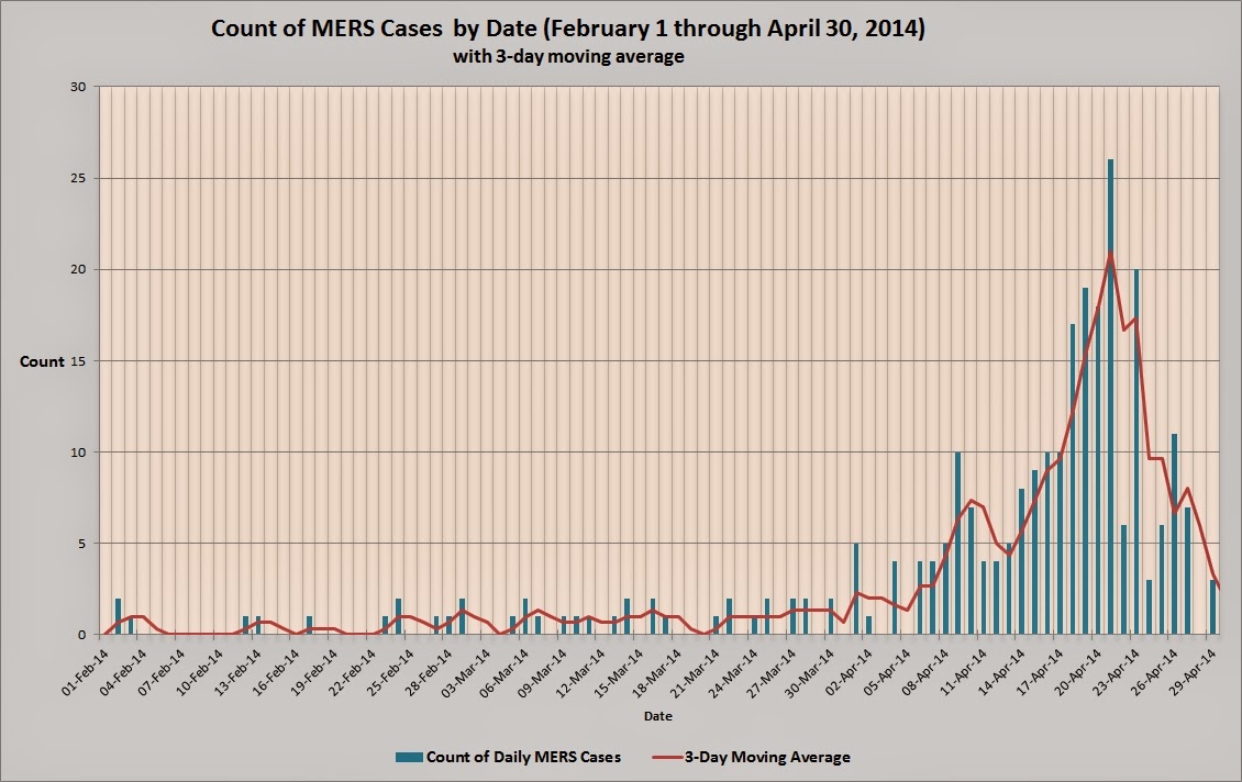
Number of Current MERS Infections on the Arabian Peninsula May Be Declining
Since January 1, 2014, about 250 cases of MERS infection have been reported by various public health agencies and official media outlets. The number of reported cases began to increase dramatically about the 9th of April. Most of these cases (about 200) have been reported from the Kingdom of Saudi Arabia.
The graph below suggests that the number of MERS cases may have peaked about April 20, and the outbreak is now being better controlled.
Notes: The date of onset for an individual case is used where available. If onset date is unavailable, the date of hospitalization or death is used. If the case is reported as asymptomatic or no other information is available, the date of report of the case is used.
Labels:
2014,
cases,
chart,
controlled,
count,
frequency,
graph,
MERS,
moving average,
outbreak,
Saudi Arabia
Wednesday, April 2, 2014
Second wave of A(H7N9) cases in the People's Republic of China peaked in weeks 4-6, 2014
The graph below shows the frequency of A(H7N9) cases by week number (based onset date) since week 47 in 2013. The infection rate started to increase in the last week of December, 2013 and the first week of January 2014. The case count continued to climb and peak between weeks 4 through 6. Since then, the number of H7N9 cases has been declining perhaps signaling an end to the second wave of H7N9 infections in China.
Subscribe to:
Posts (Atom)